Inks: Mixing, Storing, Choosing the Right Type
(Screen printing Tools & Materials series, Part 4)
Ink is one of the most personal parts of screen printing. Everyone has their own preferences — thickness, translucency, colour range, even the way they store their pots. I’ve settled into a system that suits the way I print: water‑based acrylics mixed thick, revived when needed, and stored in a way that keeps a decade’s worth of colours close at hand.
In this post, I’ll walk through the inks I use, how I mix them, the colours I rely on most, and the simple storage habits that keep everything organised in a small studio.
Inks: Mixing, Storing, Choosing the Right Type
I use Daler Rowney System 3 acrylic paint with their water‑based printing medium for all my inks. The last time I used spirit‑based inks was back in art college, and I’ve never felt the urge to return to them. They’re messy, smelly, and a pain to clean up. Give me water‑based inks and I’m a happy soul — simple to mix, simple to clean, and perfect for the way I work.
How I Mix My Inks
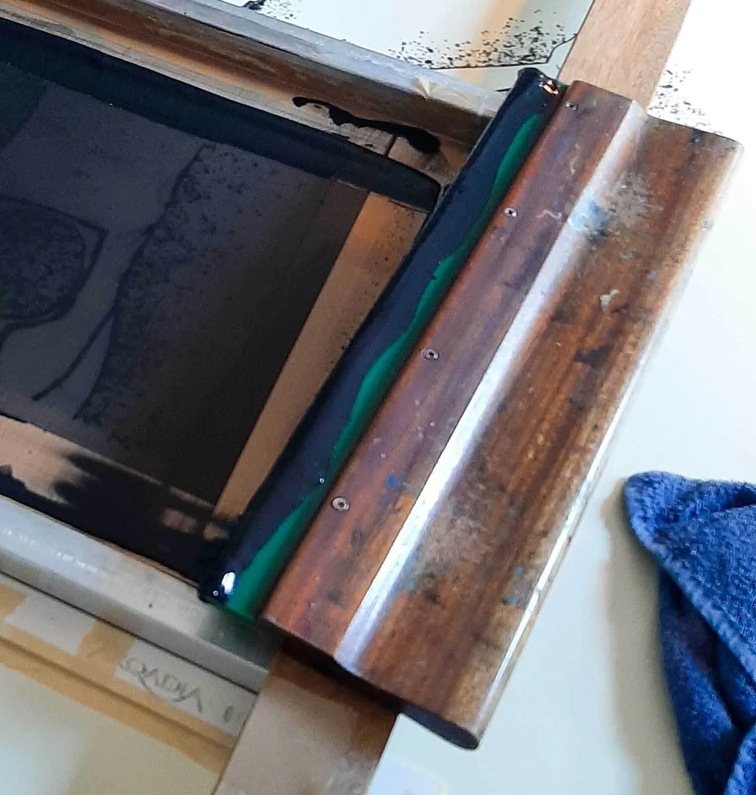
I tend to mix my inks on the thicker side. I’m not entirely sure how thick “double cream” is meant to be, but my inks are probably a touch thicker than that — thick enough to drop lazily off the mixing stick. Any thinner and I find the ink more prone to bleeding; any thicker and you risk patchy prints where the ink doesn’t fully transfer.
The printing medium is what makes the ink glide smoothly and stops it drying too quickly on the screen. The more medium you add, the more translucent the ink becomes, which is brilliant for layering and for creating almost watercolour‑like effects. I buy the medium in 5‑litre tubs, which is convenient but comes with one drawback: the consistency varies. My current tub is noticeably runnier than the last, which is mildly annoying but manageable.
Unless I’m deliberately aiming for translucency, I usually mix one part medium to three parts paint.
Colour Mixing: My Favourite Part
I love mixing colours. Titanium white is the colour I get through fastest, and I keep several versions of the primaries — a few yellows, blues and reds — plus the process colours (cyan, magenta, yellow and black), gold, silver and Mars black.
I almost always know the colour I’m aiming for before I start mixing, though sometimes the plan is to reach that colour through two or three overlaid layers. That part feels like alchemy — printing small test rectangles, overlapping them with potential second and third layers, watching the tones shift until the right one appears.
Old Inks, New Uses
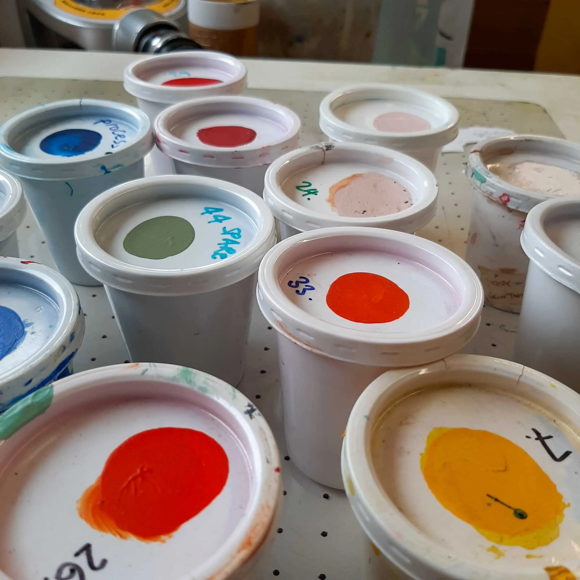
Some of my inks go back more than a decade. I have around 120 pots in total, each one a little time capsule from previous work. I love that continuity — reusing colours creates a thread that runs through the prints.
Amazingly, the inks stay usable for years. They may dry out a little, but a splash of water and a long mix usually brings them back. I keep a lidded jar of clean water next to the printing table specifically for this purpose.
Occasionally an old ink becomes lumpy. You can sometimes get away with this for line work, but for open areas of colour it’s a recipe for visible streaks. At that point it’s best to recreate the colour from scratch. The lumpy leftovers can always be used for an impromptu painting session.
Storing the Inks
I store my inks in shallow plastic boxes under the storage cupboards and on shelves I built a couple of years ago. If the pots aren’t transparent, I add a splodge of ink to the outside so I can see the colour at a glance. It also creates a beautiful accidental artwork — the ink‑pot shelves are one of my favourite bits of wall in the studio.
———
This post is part of the Screen printing Tools & Materials Series

I use water‑based acrylic inks for all my printing, mixing them thick, storing them carefully and reviving older colours when needed. In this post, I share how I mix my inks, the colours I keep on hand, and the storage setup that keeps more than 120 pots in good working order.