BIO
A creative journey shaped by expression, storytelling, and the search for understanding
My creative path has always been shaped by expression. Before I ever picked up a squeegee, I spent years immersed in dance and figure skating — art forms that taught me discipline, repetition, and how expression can be carried through the body. Those early experiences didn’t make movement a subject of my work, but they shaped the way I approach making: with focus, precision, and a deep respect for the process of translating experience into form.
I grew up surrounded by storytelling. My father was a cartoonist, and I devoured weekly comics as a child, absorbing their rhythm, humour, and visual language. In my teens I chose figure skating over dance, a decision that eventually led me away from performance and toward visual art.
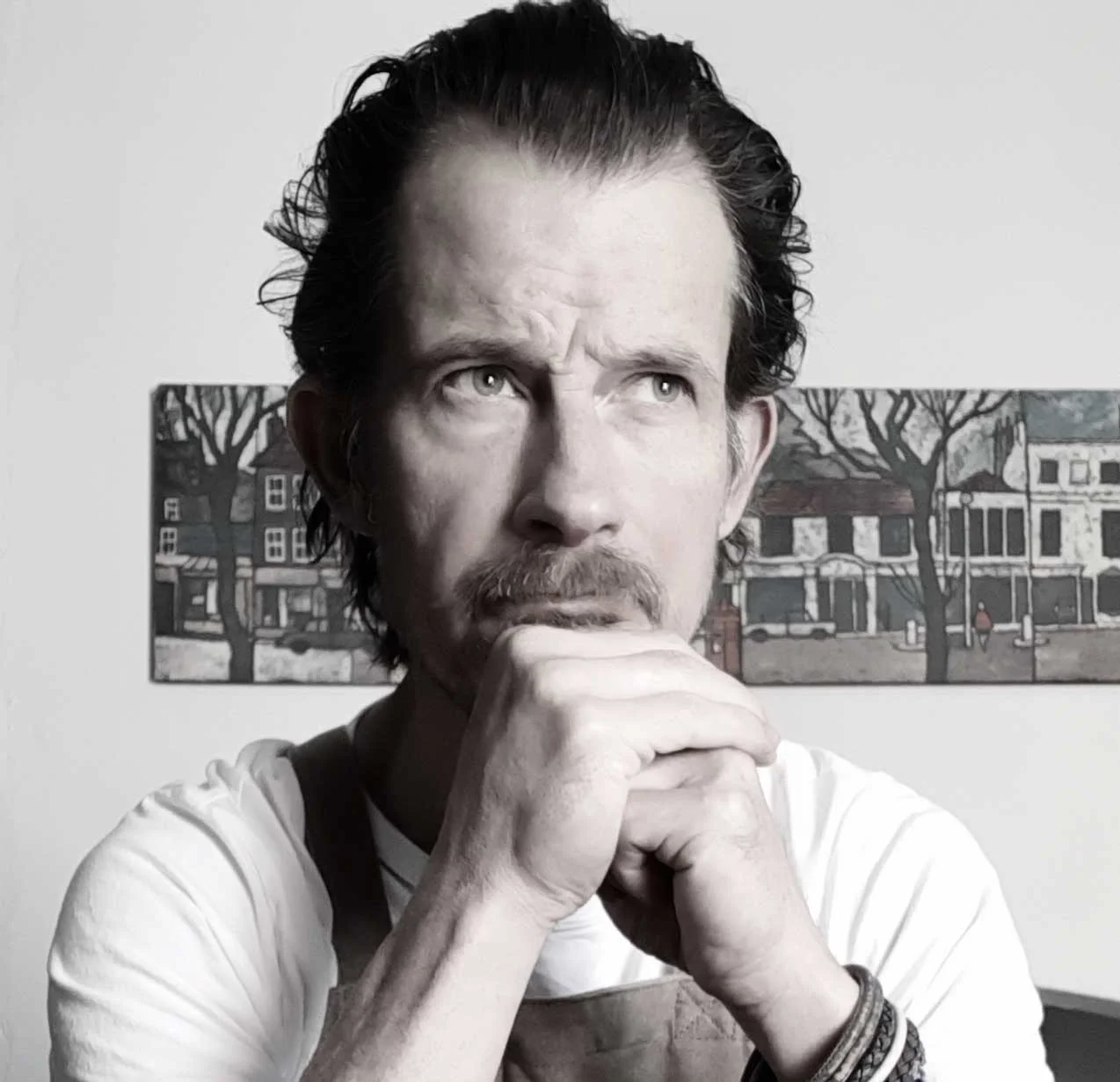
After an Art Foundation course in Maidstone, Kent, I studied fine art in Cheltenham, specialising in printmaking. Over the following decade I explored painting, illustration, scriptwriting, filmmaking, and even home design — a mix of disciplines that broadened my creative lens and taught me to approach ideas from multiple angles.
In 2011 I moved to the south‑west of England and returned fully to printmaking, establishing the small garden studio where I’ve now worked for more than a decade. My relationship with silkscreen, however, stretches back over thirty years. It remains the medium through which I think most clearly, reflect most deeply, and translate experience into visual form.
Becoming a father in 2013 and 2014 changed my work in ways I couldn’t have predicted. Parenthood brought vulnerability, humour, and emotional depth into my practice, and it continues to shape the way I respond to the world.
In 2020 I discovered my autistic identity — a realisation that profoundly shifted how I understand myself and my work. It offered a new lens through which to revisit earlier projects and continues to influence how I explore attention, perception, and the details that ask to be understood. This perspective has become an integral part of my practice, deepening the way I approach experience through printmaking.