ASSORTED WORKS Collection
Explore A SELECTION OF ASSORTED WORKS
A selection of unframed and Artist-framed prints, works on board and mixed media works.
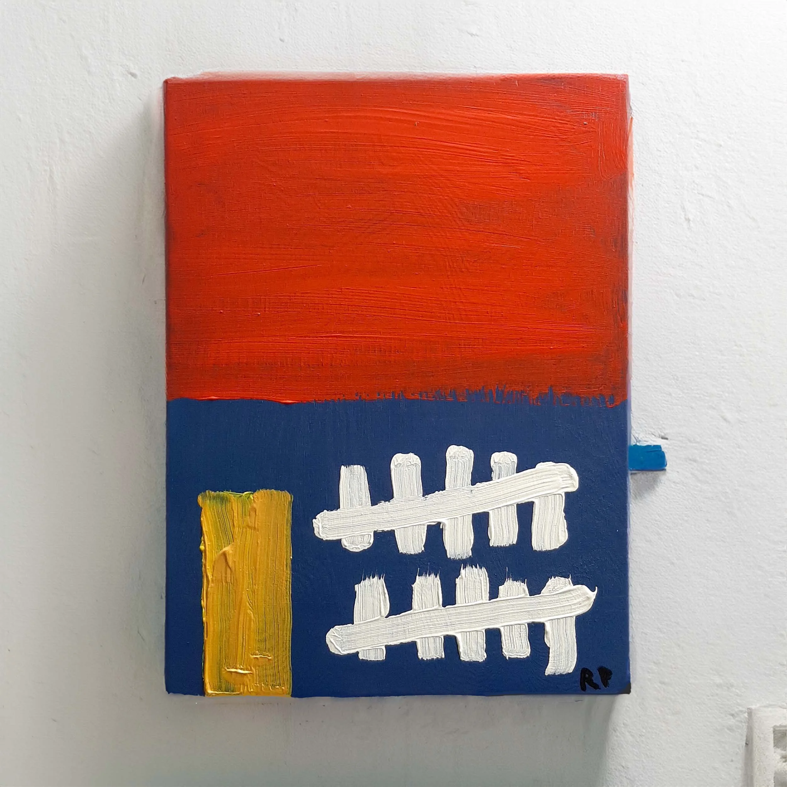
In 'Bad Tally,' I dive into the tension between spontaneity and structure, aiming to create a piece that flows naturally while maintaining a cohesive visual framework. Painted with acrylics on board, the work features a striking contrast between a fiery red upper section and a deep blue lower half, reminiscent of a sky ablaze at dusk over land shrouded in shadow.
The bold yellow rectangle serves as a focal point, representing a golden doorway—or perhaps a hole dug for a grave. This element introduces themes of transition, opportunity, and the duality of beginnings and endings. Meanwhile, the white horizontal lines evoke the image of a shattered train track, suggesting a journey or passage. They also resemble a tally count, hinting at records or memories—maybe even errors or miscounts, aligning with the title 'Bad Tally.'
This piece reflects a complicated and problematic time I experienced in France. By trying to make as few conscious decisions as possible, I allowed the elements to emerge organically, throwing in components rather than meticulously planning each detail. This approach adds an element of authenticity and raw emotion to the work.
The ambiguity in the imagery invites you to delve deeper and question your own interpretations. Is the golden doorway a path to new opportunities, or does it symbolize something lost? Did the shattered train track lead somewhere meaningful, or is it a metaphor for uncertainty and the complexities of life's journey?
'Bad Tally' challenges the notion of perfection and embraces the imperfections inherent in both art and life. I’m not entirely sure what to make of it myself—whether it’s an honest expression or just a bit off-kilter—and that uncertainty is part of the piece's essence. It encourages contemplation and personal connection, leaving space for you to find your own meaning within it.
Summary:
Acrylic on plywood:
Size: 38cm x 28cm
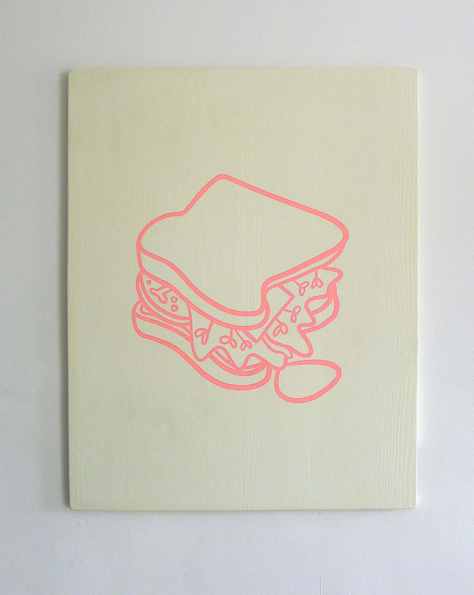
My work usually sits somewhere between conceptual and minimalist ideas, but I’m mostly interested in where big, universal themes meet everyday personal moments. This piece — a screen‑printed sandwich on painted plywood — is my way of thinking about how full life can feel, how messy it gets, and how temporary it all is.
The sandwich stands in for the human experience. Each layer hints at the mix of adventures, mistakes, relationships, and losses we collect over time. The way the fillings spill out past the edges matters to me — it suggests the parts of life we can’t control, the moments that slip away or leave marks we didn’t expect.
Using painted plywood was a deliberate choice. It gives the piece a rough, physical presence that plays against the clean lines of the screen print. That contrast between the handmade and the graphic creates its own kind of tension. The size feels personal but still big enough to hold broader ideas.
In the end, the work is really about life as a pile of moments rather than a neat story. It’s about the vivid, chaotic, fleeting bits we try to hold together. I hope it encourages people to think about their own layers, their own spills and imperfections, and maybe find some beauty in the chaos and the fact that nothing lasts forever.
Summary:
Acrylic on plywood
Size: W49.5cm x H64cm

Double sided silkscreen print on cartridge paper utilising Letraset text
This series uses proofing sheets created whilst printing the artist’s Talking Heads and Kaboom! Honiton series. The text is taken from entries in the bullet journal kept by the Artist in 2020/2021 during a tumultuous period discovering his Autistic identity
Summary:
Double sided work
Silkscreen on cartridge
Size: 59.4cm x 84.1cm (A1 size)

Double sided silkscreen print on cartridge paper utilising Letraset text
This series uses proofing sheets created whilst printing the artist’s Talking Heads and Kaboom! Honiton series. The text is taken from entries in the bullet journal kept by the Artist in 2020/2021
Summary:
Double sided work
Silkscreen on cartridge
Size: 59.4cm x 84.1cm (A1 size)

Global Health Emergency is a work born out of one of the most turbulent periods of our recent history—a time when crisis was not an abstract concept but a relentless, all‐consuming reality. Begun in 2020 and completed three years later, this piece is a direct meditation on the transient nature of urgency and the shifting focus of collective attention.
At first glance, the work confronts the viewer with a boldly charged composition. The urgent orange background acts as an alarm—a visual call to awareness—while the central blue circle, evocative of both Earth and a virus, anchors the piece in the specific narrative of pandemic life. Encircling this motif, red hammers act as a striking counterpoint, symbolising both the force of intervention and the destructive impulse that emerges in moments of crisis. The overlaid instruction, “IN CASE OF (GLOBAL HEALTH) EMERGENCY BREAK GLASS”, transforms the work into an object of both guidance and critique. It is reminiscent of the emergency kits we encounter in our daily environments, yet here it becomes an ironic commentary on how society responds to crises that quickly recede from public consciousness.
On one level, the work reflects a disquieting observation about our cultural moment: the world is invariably fixated on what is immediately relevant, only for the urgency to evaporate as new crises emerge. In this way, Global Health Emergency captures the fleeting nature of panic and intervention—the way headlines are consumed, only to be replaced with the next spectacle of crisis. Its design, stark and uncompromising, speaks to our collective short attention span; what is once seen as a matter of acute emergency soon becomes a relic of an era marked by its immediacy.
Simultaneously, the piece is a commentary on art’s own oscillation between vogue and obsolescence. As the moment it refers to ages and becomes, in a sense, outdated, its relevance paradoxically deepens. The irony is palpable—the more the work is seen as a document of a past emergency, the more it criticises the ephemeral quality of cultural attention. In this layered way, the work engages with the notion of art coming in and out of fashion, challenging the viewer to question both what we deem urgent and how we invest meaning in objects that are, by nature, transient.
Through its visual directness—employing strong, declarative colours and simple yet monumental iconography—*Global Health Emergency* distils complex socio-political commentary into a singular image. It invites the viewer to question not only the mechanisms of response to global crises but also the processes that render these responses ever fleeting, always subject to the relentless march of time.
Ultimately, the work serves both as a time capsule of a once-prevailing global mindset and as an enduring critique of our ongoing cultural habits. It stands as a reminder that even as the immediacy of an emergency fades, the structural tendencies of attention and disengagement persist. For me, the piece encapsulates the beauty of creating art that evolves in meaning over time—the more outdated it appears, the more unmistakably relevant its message becomes.
In Global Health Emergency, the ephemeral nature of both crisis and artistic fashion is not a limitation but a potent reminder. It challenges us to confront how we measure urgency and to consider the legacy of our visual culture in recording the fleeting yet significant events that shape our world.
In ‘Goal’, I capture the essence of a memorable experience through an expressive and abstract composition. The black arch-like shape and green background evoke the image of a football goal and pitch, representing the time spent watching my son play in a youth football team. This central element holds both structure and emotional significance, grounding the piece in a personal narrative.
The vibrant oranges in the top right corner add a sense of mystery and intrigue. These spectral apparitions might be open to interpretation, perhaps symbolizing fleeting moments or emotions that arise during such experiences. The contrast between the warm hues and the cool tones of the blue and purple sections creates a dynamic and engaging visual journey.
The lower third of the painting resembles a cityscape shrouded in dense smog, representing an unhealthy and unnerving past. The light pink and blue lines cutting across this area symbolize a protective barrier of family, shielding against the past and paving the way for a new beginning in the countryside. The yellow surrounding the football pitch signifies the unknown future—mysterious and full of potential, yet not without its perils.
This artwork, much like the rest of the series, embraces spontaneity while maintaining a cohesive visual framework. Painted with acrylics on board, it reflects a balance between the conscious and unconscious elements of the creative process. The layers of paint and texture invite viewers to explore their own interpretations, making connections between the visual elements and their own experiences.
Summary:
Acrylic on plywood:
Size: 38cm x 28cm